What is most interesting is the small cap index, RUT. Not only did it lose 1.2% this week while the other indices gained, but it is now more than 5% off its peak. For the year, RUT is negative and SPX is up 9%.
Is this divergence between SPX and RUT bearish? It would seem it should be. When small caps underperform, it indicates weakness in breadth as investors concentrate their buying in a relatively small number of large companies.
The problem is these divergences have usually not been bearish in the past few years. The yellow highlights below are times when small caps underperformed large caps (lower panel). Each time, SPX continued higher (top panel). The main exception was in 2012 (in orange).

Moreover, there were several instances where small caps outperformed large caps right into a market peak (shown with arrows). If anything, that has been a better predictor of trouble for SPX. Why would this be? When small caps outperform, investors are chasing performance. It's a beta chase, and this indicates exuberance. At an extreme, this exuberance is punished with a market correction.
All of that said, the overall pattern in RUT is concerning. Below is a weekly chart since the early 1990s. Previously, when RUT has run up strongly and then formed a choppy horizontal pattern over many months (like now), it has been a noteworthy top. In each of these prior cases, RUT has subsequently fallen at least 15% and sometimes 30% or more. SPX is not likely to emerge unscathed if RUT falls more than 15%. As we have continually pointed out, RUT is valuable canary for the overall market, for both strength and possible weakness.

One of the issues likely plaguing RUT's performance is valuation. RUT nearly doubled between 2012 and the start of 2014. It strongly outperformed SPX. During this time, it went from being relatively undervalued to be overvalued (more than a standard deviation above its mean). The only times valuations have been as high as now were in 1998 and 2000, and RUT tumbled more than 30% both times (chart from GS)

It's worth pointing out that overvaluation is not unique to RUT. Whether you base the valuation metric on sales, current earnings, past 10-year earnings or balance sheet measures, US equities are trading at a significant premium. The chart below uses Tobin's Q, a valuation metric based on firms' balance sheets. The only higher valuations in the past 115 years came at the end of the 90s (chart from Doug Short).

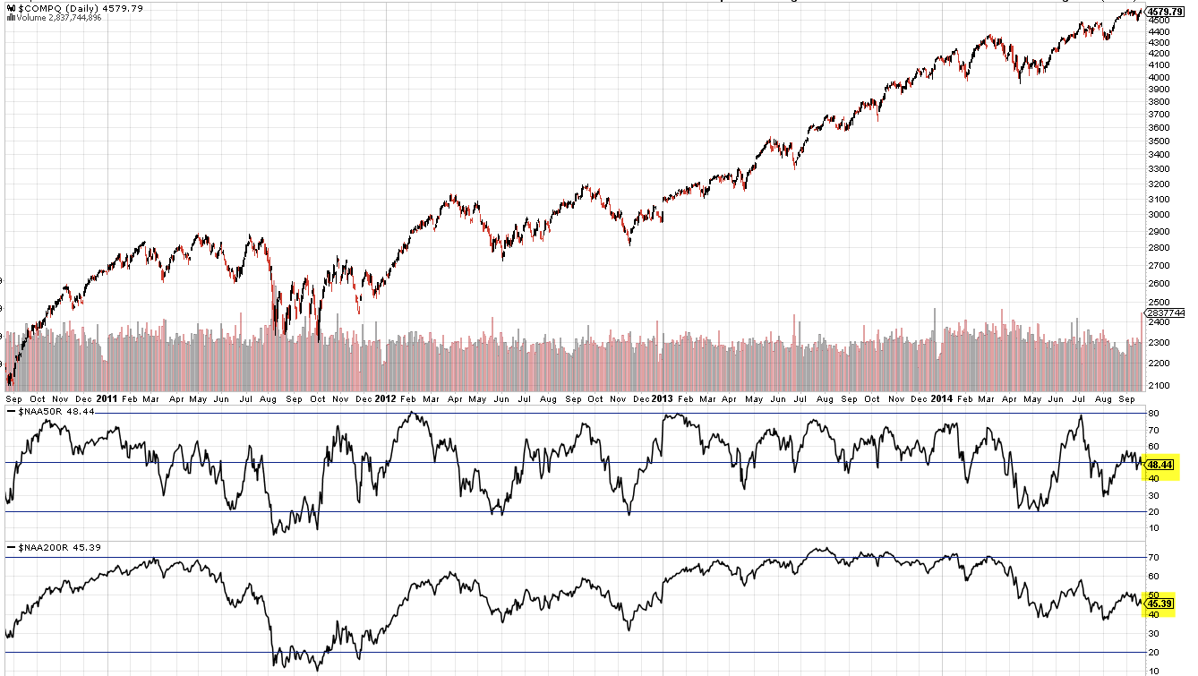
It's also worth pointing out that the weak breadth that small caps are signaling is present in the broader market as well. Remarkably, less than half of Nasdaq stocks are trading above either their 50-dma or 200-dma. You would be hard pressed to find a similar circumstance with breadth that weak when the index is at a 14 year high.
The Week Ahead
Our expectation in our last update was for equities to rise further. Recall that SPX had closed above its 5-dma for 18 days in a row for only the second time in the past 5 years (the other time was June 2013). That type of strength rarely marks the end of an uptrend. Momentum carries the index higher. It did again this time.
8 of the 9 SPX sectors remain in a strong uptrend (the exception is energy) as are SPX, DJIA and NDX. The trend appears to be broadly higher.
That said, our expectation is that markets will turn week, at least short term.
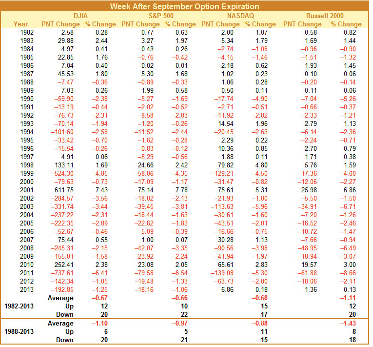
Seasonality the week after September options expiration (i.e, this coming week) is exceptionally poor. The week has been up only 5 times in the past 26 years (19%). This may be due to profit taking before quarter end (chart from Stock Almanac).
Similarly, Quantifiable Edges has previously shared that when options expirations week is strong (like it was this week), then the following week is usually poor. The returns worsen as the week progresses.

Moreover, Vix spiked higher on Monday and then retreated. We have noted this pattern before. Since the start of 2013, spikes higher in Vix have come in pairs (vertical lines). Any SPX gains subsequent to the first spike have been lost by the time of the second spike (note the horizontal lines within the yellow shading). This implies a return to 2000 or lower.

The Bollinger Bands for SPX have also become exceptionally tight (lower panel). This has also been a prelude to greater volatility (red boxes) that has pushed SPX at least to its lower Bollinger (red arrows, top panel). The lower Bollinger for SPY is close by (198).

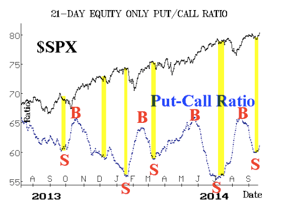
Equity put/call ratios are turning higher. In the past, this has coincided with choppiness and/or weakness in SPX (chart from Larry McMillan).
Skew reached an extreme high on Friday. A high skew means that the options market is pricing in a large move in equities. The last three times skew spike higher, SPX struggled and eventually fell over the next month. All SPX gains subsequent to the spike higher in skew were given up. This was the case in May 2012, December 2013 and June 2014 (chart from Sentimentrader).

SPY ended the week pushed up against a trend line from July that has impeded further gains in the past. It held the high on Friday as well. SPY is more likely to retreat before attempting to move higher. First support is near 200, then the July tops near 198 that coincide with the lower Bollinger.

The leader, NDX, is about 1% below its 9-month trend line. Note the loss of momentum in RSI at all-time highs.

RUT is again below the key 1160 support/resistance area. There is no trend. A break below 1080 would likely be highly significant to the overall market.

Finally, bond yields have gained about 200 bp so far in September. The upturn high was stopped at 2.64%, an area which also stopped prior rallies in June, July and August. Note the loss of momentum in RSI (top). If the trend in bond yields has turned higher, then a move back to its flat 50-dma might first be in store. This was the pattern in November 2013 (arrow). A clear trend change is not yet evident and yields might be establishing a range. Watch the slope of the 50-dma for clues.

Our weekly summary table follows.
If you find this post to be valuable, consider visiting a few of our sponsors who have offers that might be relevant to you.